
Team SPG Help
How Do I Use the Team SPG Dashboard?
The Team SPG dashboard shows your whole team's performance at a glance: working-days progress, six technician metric cards, three CSR metric cards, and per-person breakdown tables — all compared against your goals with green/red color coding. Pick a date period at the top, hover any card for goal and pace details, and click column headers to sort.
Dashboard Overview
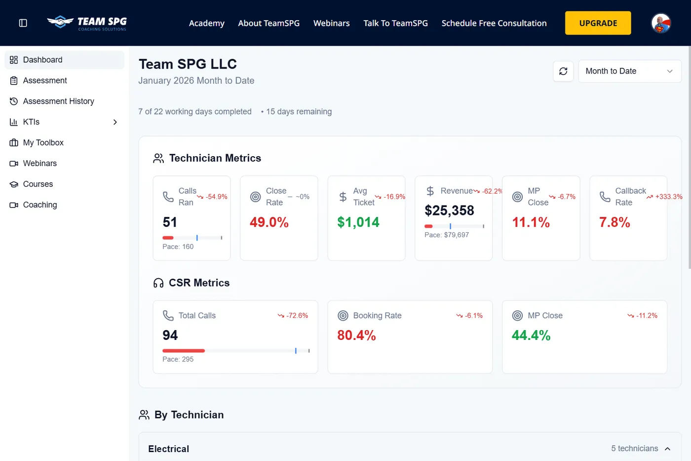
Your dashboard is divided into several key sections:
- Header - Company name, date range selector, and refresh button
- Working Days Progress - Shows completed and remaining working days
- Technician Metrics - Six key performance cards
- CSR Metrics - Three key performance cards
- By Technician Table - Individual technician breakdown
- By CSR Table - Individual CSR breakdown
Date Period Selection
At the top of the dashboard, you'll see a dropdown to select your time period:
- Month to Date - Current month's data from the 1st to today
- Last Month - Previous full month's data
- Year to Date - Data from January 1st to today
- Last 30 Days - Rolling 30-day period
To change the period:
- Click the period dropdown (shows current selection)
- Select a different period
- The dashboard automatically updates with new data
Working Days Progress
Below the company name, you'll see:
- "X of Y working days completed"
- "Z days remaining"
This shows your progress through the current month based on your configured working days (set in Company Settings).
Technician Metrics Cards
The Technician Metrics section displays six key performance indicators in individual cards:
Calls Ran
- Shows total calls run by all technicians
- Displays a progress bar comparing current vs. goal
- Shows pace projection (where you're on track to finish)
- Hover over the card to see a tooltip with:
- Goal value
- Current pace
- Comparison to previous period
- Trend arrow shows if you're up or down vs. previous period
- Percentage change displays next to the arrow
Close Rate
- Shows percentage of opportunities converted to sales
- Green text = meeting or exceeding goal
- Red text = below goal
- Hover to see goal and comparison
- Trend arrow and percentage change display
Avg Ticket
- Shows average dollar amount per completed job
- Green text = meeting or exceeding goal
- Red text = below goal
- Hover to see goal and comparison
- Trend arrow and percentage change display
Revenue
- Shows total revenue for all technicians
- Displays a progress bar comparing current vs. goal
- Shows pace projection
- Hover to see goal, pace, and comparison
- Trend arrow and percentage change display
MP Close
- Shows maintenance plan close rate percentage
- Green text = meeting or exceeding goal
- Red text = below goal
- Hover to see goal and comparison
- Trend arrow and percentage change display
Callback Rate
- Shows percentage of callbacks (lower is better)
- Green text = at or below goal (2% or less)
- Red text = above goal
- Hover to see goal and comparison
- Trend arrow and percentage change display (inverted - down is good)
Understanding Trend Arrows
- Green up arrow = Improvement (good for most metrics)
- Red down arrow = Decline (bad for most metrics)
- Green down arrow = Improvement for Callback Rate (lower is better)
- Red up arrow = Decline for Callback Rate (higher is worse)
- Minus sign = No significant change (~0%)
CSR Metrics Cards
The CSR Metrics section displays three key performance indicators:
Total Calls
- Shows total calls handled by all CSRs
- Displays a progress bar comparing current vs. goal
- Shows pace projection
- Hover to see goal, pace, and comparison
- Trend arrow and percentage change display
Booking Rate
- Shows percentage of calls converted to appointments
- Green text = meeting or exceeding goal (85%+)
- Red text = below goal
- Hover to see goal and comparison
- Trend arrow and percentage change display
MP Close
- Shows maintenance plan close rate percentage
- Green text = meeting or exceeding goal
- Red text = below goal
- Hover to see goal and comparison
- Trend arrow and percentage change display
By Technician Table
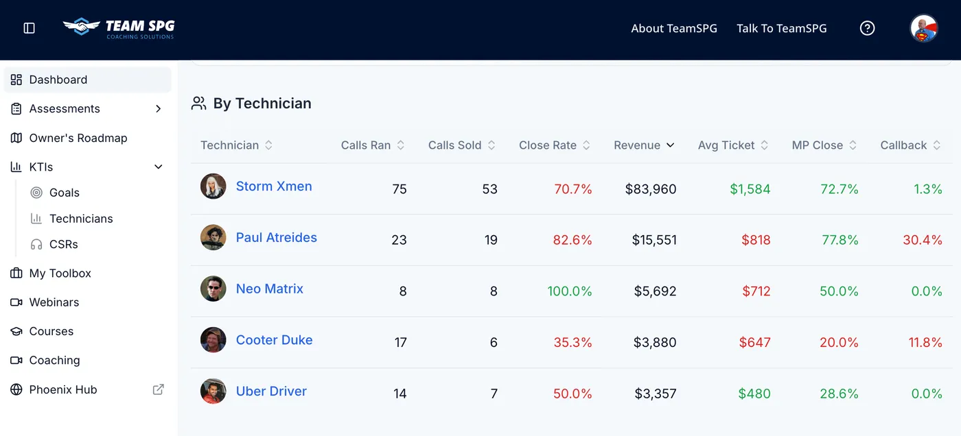
The "By Technician" section shows individual technician performance in a table format.
Trade Sections
Technicians are grouped by trade (e.g., "Electrical", "HVAC", "Plumbing"):
- Trade name displays as a section header
- Technician count shows (e.g., "5 technicians")
- Chevron icon (^ or v) appears next to the trade name
- Click the chevron to expand or collapse the trade section
Table Columns
The table displays the following columns:
- Technician - Name with avatar/profile picture
- Calls Ran - Total service calls
- Calls Sold - Successful sales
- Close Rate - Percentage (e.g., "75.0% / 75%")
- First number = actual rate
- Second number = goal
- Green text = meeting goal
- Red text = below goal
- Revenue - Total sales amount
- Avg Ticket - Average job value (e.g., "$1174 / $1400")
- First number = actual
- Second number = goal
- Green text = meeting goal
- Red text = below goal
- MP Close - Maintenance plan close rate
- Green text = meeting goal
- Red text = below goal
- Callback - Callback rate percentage
- Green text = at or below goal (2% or less)
- Red text = above goal
Sorting Technicians
Click any column header to sort:
- Calls Ran - Sort by total calls
- Revenue - Sort by total sales (default: highest to lowest)
- Close Rate - Sort by conversion percentage
- Avg Ticket - Sort by average job value
- Click the same header again to reverse the sort order
By CSR Table
The "By CSR" section shows individual CSR performance with columns:
- CSR - Name
- Leads - Total leads handled
- Booked - Leads converted to appointments
- Booking Rate - Percentage
- MP Opps - Maintenance plan opportunities
- MP Sold - Maintenance plans sold
- MP Close - Close rate percentage
- Total Calls - Total calls handled
Click column headers to sort by any metric.
Refresh Button
In the top right corner of the dashboard, you'll see a circular refresh button (↻):
- Click the refresh button
- The page reloads all data
- A brief loading indicator appears
- Updated data displays
Use this if you've made changes and want to see the latest numbers.
Dashboard Visibility
Owners can control what each role sees on the dashboard. See Company Settings for detailed configuration.
What Each Role Sees
Based on visibility settings:
- Owners - Always see everything (cannot be restricted)
- Leaders - See sections enabled in Dashboard Visibility settings
- Managers - See sections enabled for managers
- Technicians - See only their own data (if Technician KTIs enabled)
- CSRs - See only their own data (if CSR KTIs enabled)
Tips for Using the Dashboard
- Check daily - Review your KTIs each morning to spot issues early
- Hover for details - Hover over any metric card to see goals, pace, and comparisons
- Use trends - Pay attention to trend arrows to spot improving or declining metrics
- Weekly reviews - Use the dashboard in team meetings to discuss performance
- Compare periods - Switch between "Month to Date" and "Last Month" to see progress
- Sort to find issues - Click column headers to quickly identify top and bottom performers
- Identify coaching opportunities - Look for technicians with red indicators who need support
- Track pace - Use progress bars to see if you're on track to meet monthly goals
Frequently Asked Questions
Why is my dashboard empty?
The selected date period has no KTI data. Switch periods with the dropdown, or add data via KTIs > Add KTI or a CSV upload — numbers appear as soon as data is saved.
Who can see the dashboard?
Everyone gets a dashboard, but what appears on it depends on role and your Dashboard Visibility settings. Owners always see everything; technicians and CSRs see only their own data unless you enable more.
How current is the dashboard data?
The dashboard reflects the latest saved KTI data. Click the refresh button in the top right to reload after making changes or running an import.
Related Topics
- KTI Tracking - Deep dive into Key Training Indicators
- Team Activity - Monitor engagement
- Settings - Configure dashboard visibility